PROJECT OVERVIEW
The Amusement Park Snack Shop, envisioned as a regional snack establishment, is a conceptual project situated in the vibrant city of Toronto, Canada. Designed with the aim of enhancing the overall experience for patrons at the amusement park, this innovative snack shop introduces a cutting-edge approach to menu selection and payment processes through a user-friendly mobile application.
At the heart of the venture is the commitment to simplifying the ordering process, ensuring that visitors to the amusement park can seamlessly navigate through a diverse and enticing menu via the dedicated application. By leveraging modern technology, the snack shop strives to streamline the entire transaction, providing a convenient and efficient solution for customers who seek to indulge in delectable treats without the hassle of long queues or complex payment procedures.
The menu itself boasts a wide spectrum of snack options, ranging from savoury to sweet, catering to the varied tastes and preferences of a diverse customer base. Whether it's the classic favorites that evoke a sense of nostalgia or innovative, trend-setting snacks, the snack shop endeavours to offer something for everyone. This eclectic array of snacks is curated to delight not only amusement park enthusiasts but also general snack consumers spanning the age spectrum from 9 to 65.
PROBLEM
Users encounter difficulties navigating the menu and face inefficiencies during the payment process, leading to frustration and time wastage. This assignment aims to analyze these UX issues and propose solutions for improving menu navigation, streamlining the payment process, and enhancing overall time efficiency within the digital platform.
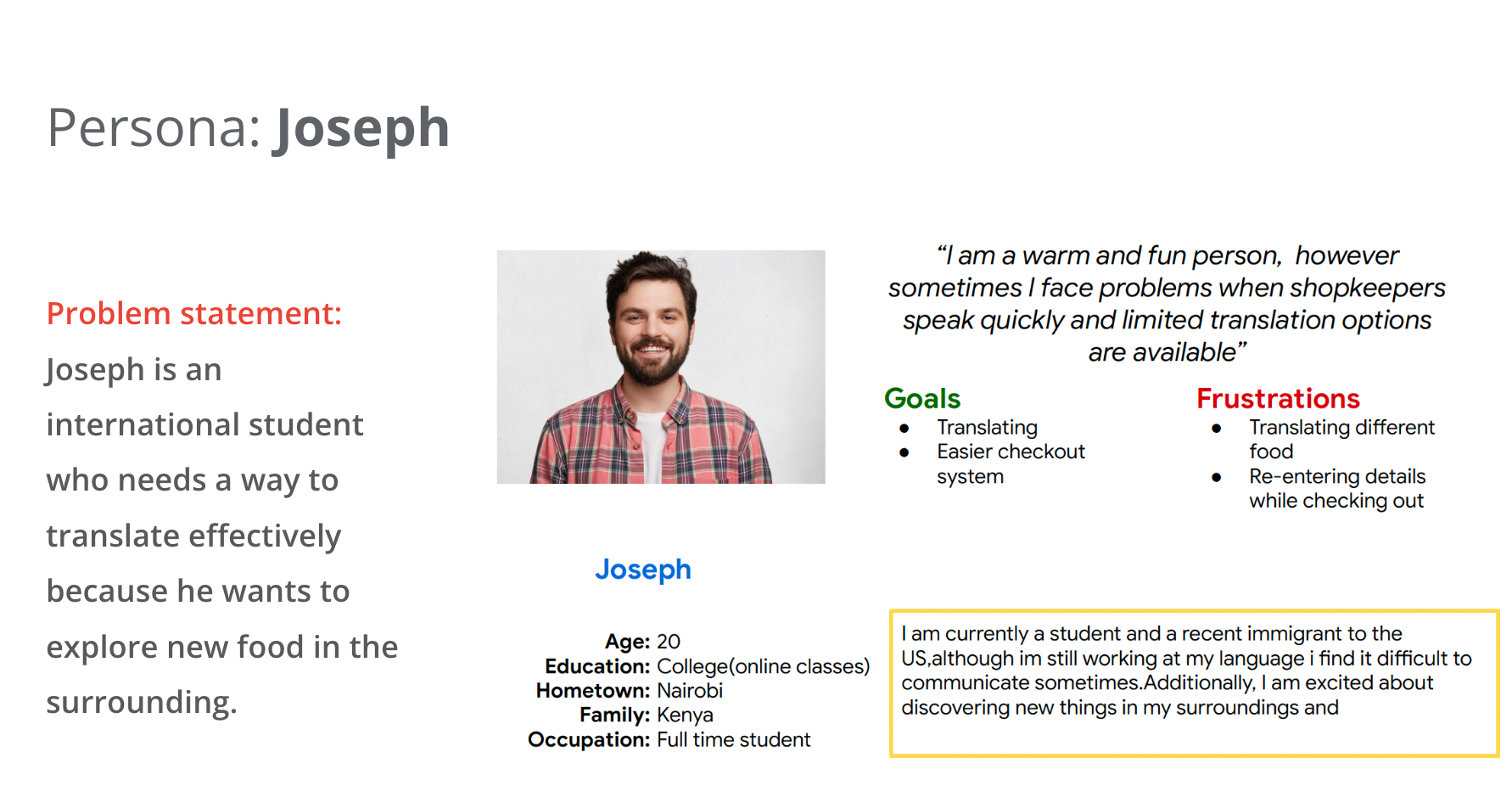
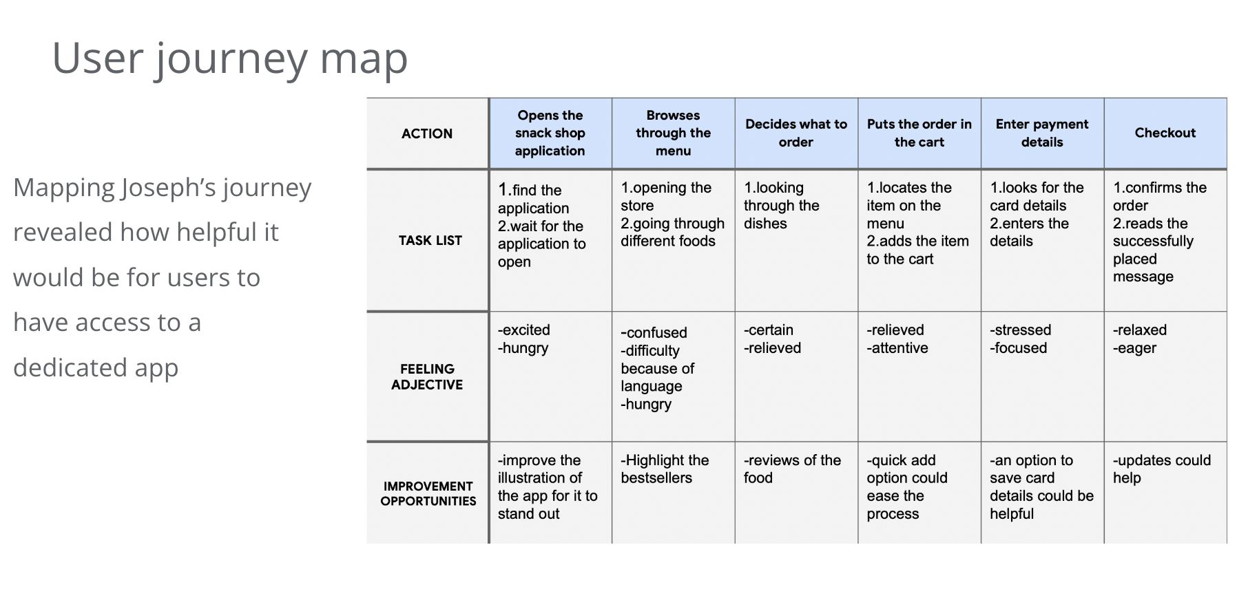
To better understand the users I'm creating for and their needs, I conducted interviews and produced empathy maps.Working adults who could find it difficult to wait in line at an amusement park or those who might want to place orders from the amusement park shop were among the main user groups discovered through study.
This user group supported early hypotheses regarding the snack store in an amusement park, but study also showed that time constraints were a problem in addition to difficulties with menu navigation and payment.
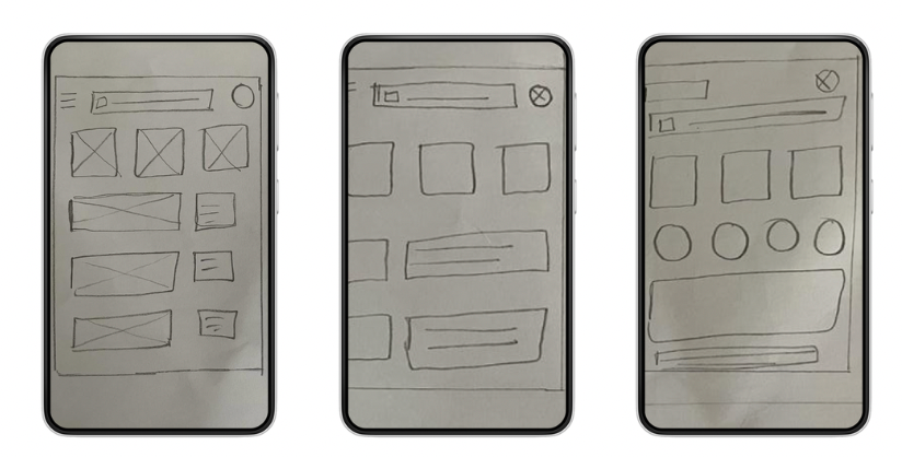
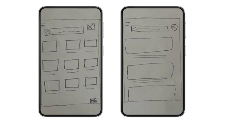
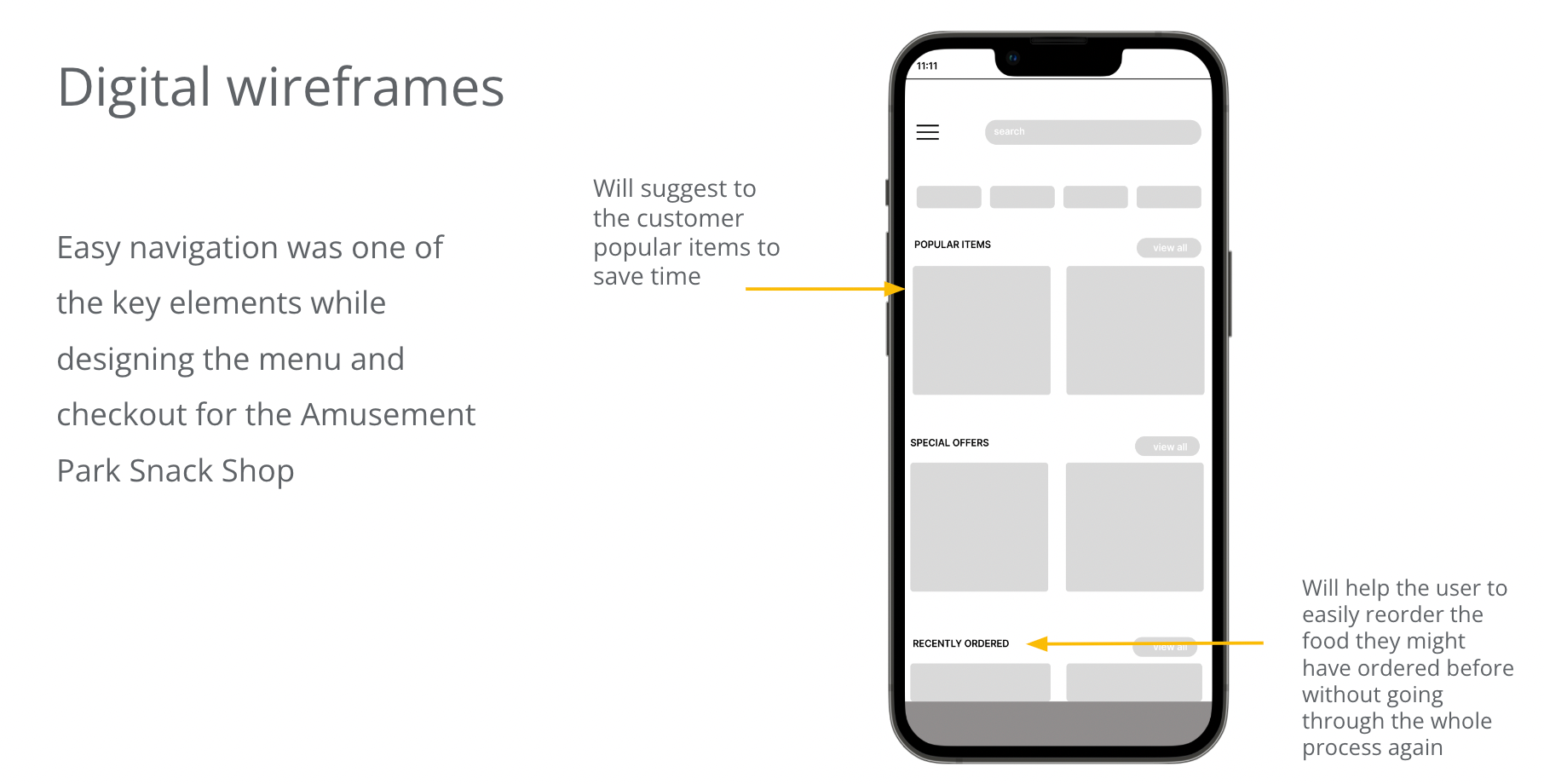
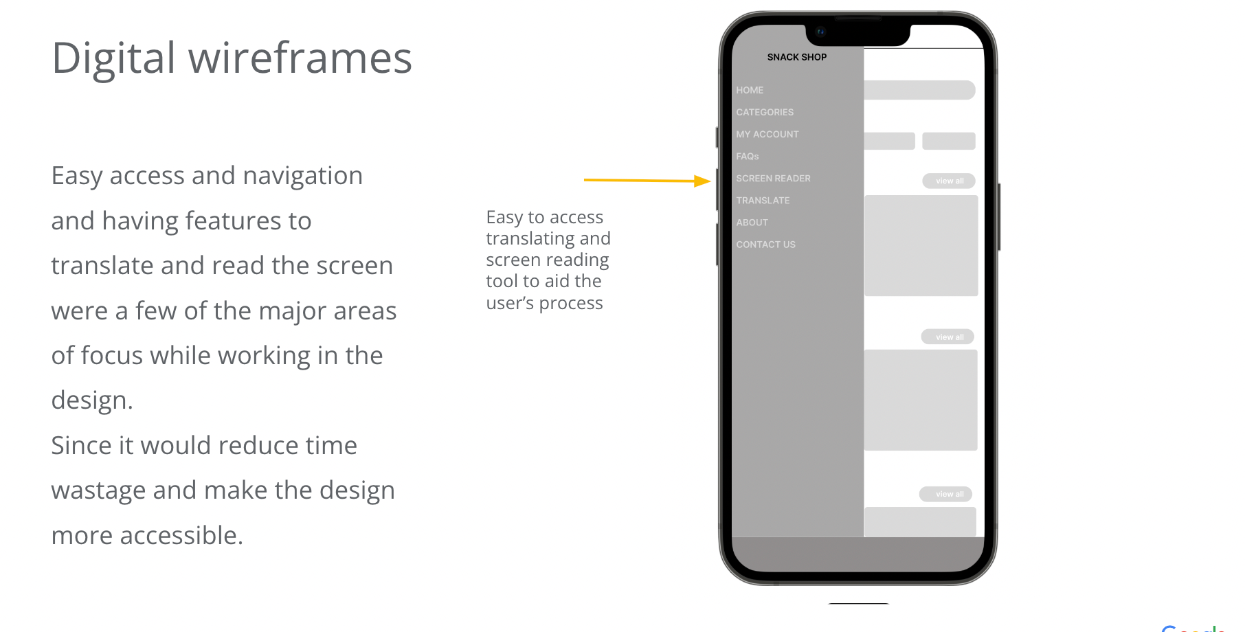
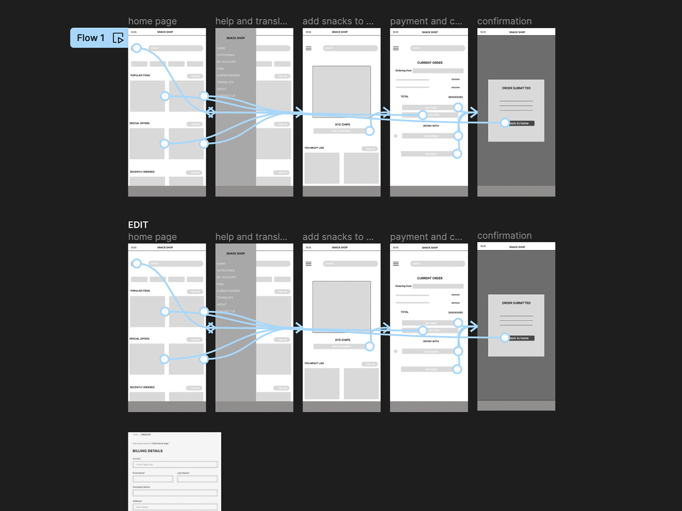
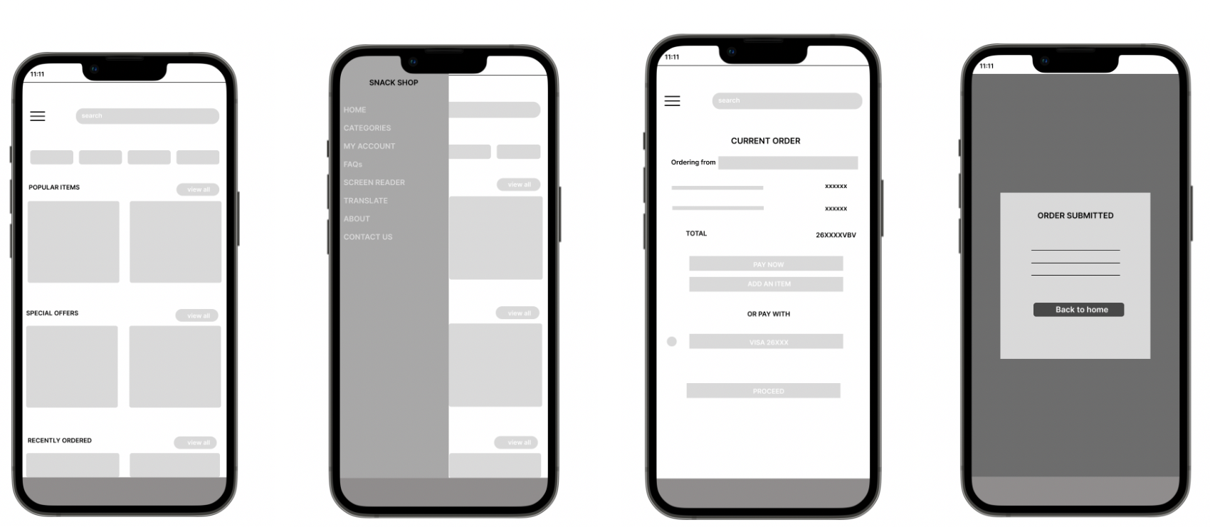
WIREFRAMES
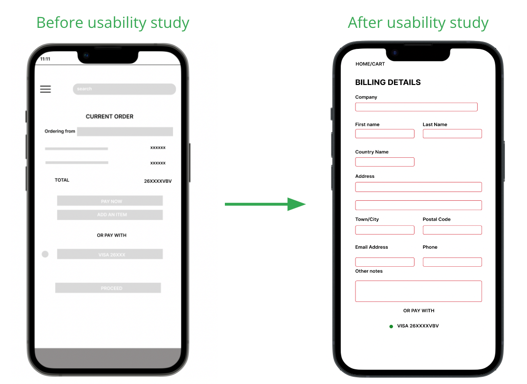
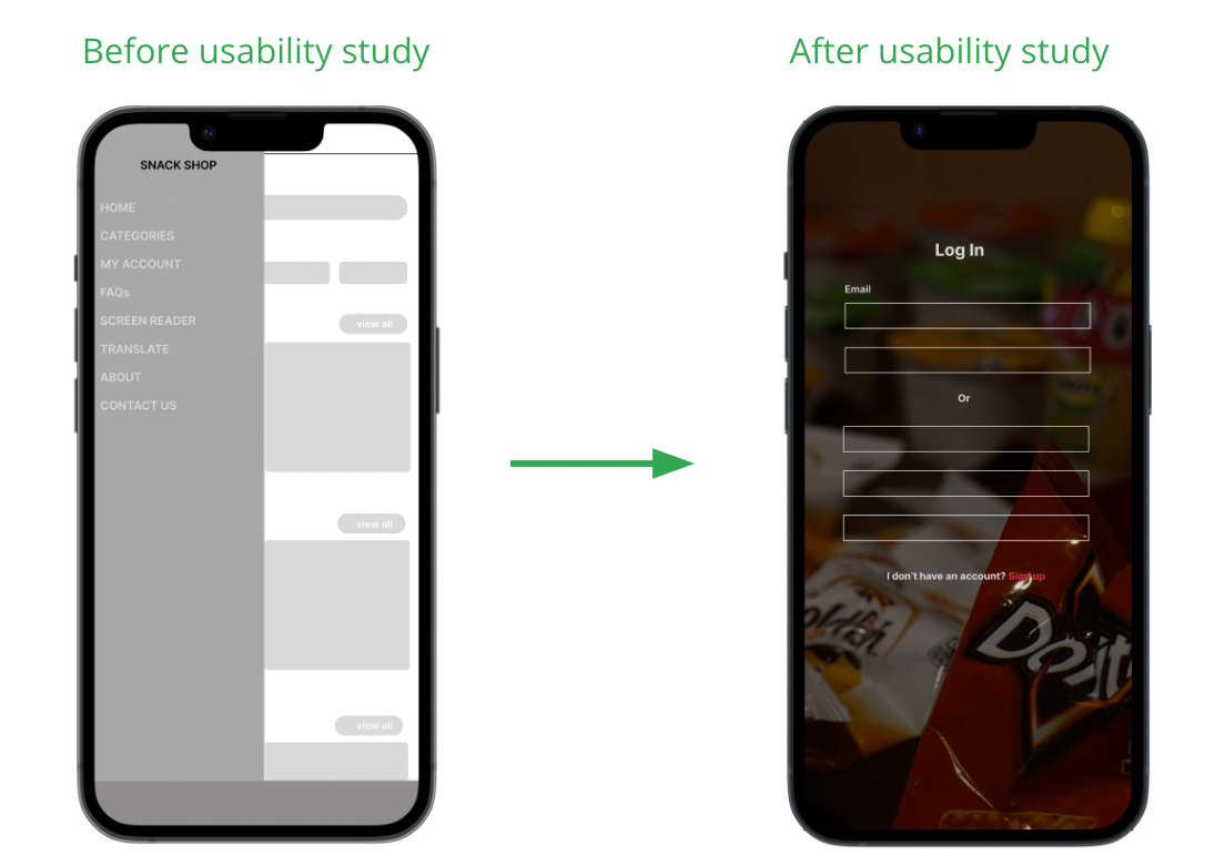
USABILITY STUDY:
Based on two rounds of usability studies, the initial findings guided the progression from wireframes to mockups. Subsequently, the second study, employing a high-fidelity prototype, identified specific areas in the mockups that required refinement and improvement.
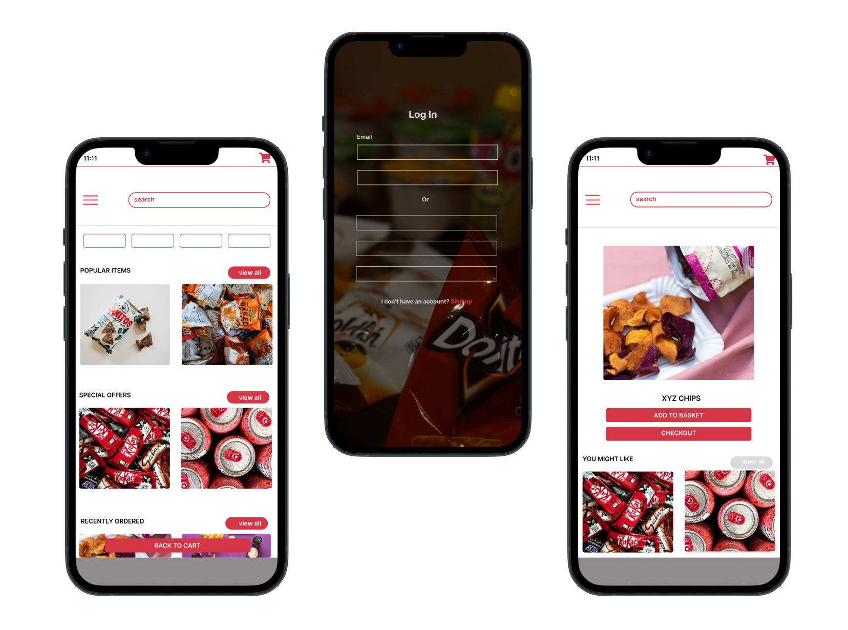
1.As per the insights gathered from the usability studies, users indicated a desire for a separate billing page to avoid overcrowding and improve navigational simplicity on both the billing and checkout sections. To address this, a distinct billing page was created to fulfill the users' need for a more structured and straightforward payment experience.
2.From what we learned through the usability studies, users mentioned the importance of having a separate place to sign in or create a new account before they start placing an order. So, to meet this need, we included a special signup page. This page lets new users make an account and also allows those who've used the platform before to log in easily. This change was made to make sure the start of the ordering process is clearer and simpler for everyone using the platform.
SOLUTION: